

Your Custom Text Here
Hughen/Starkweather
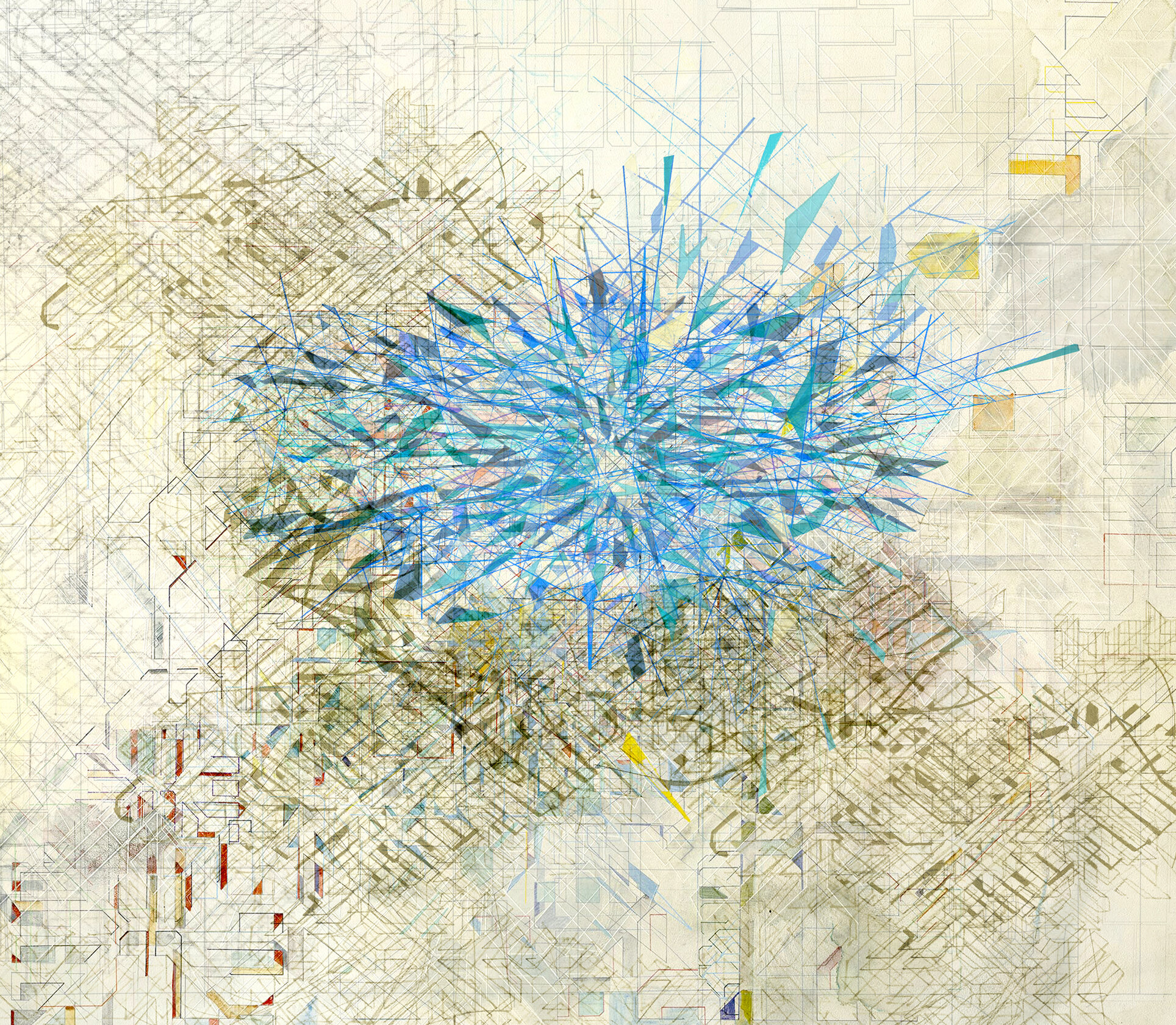
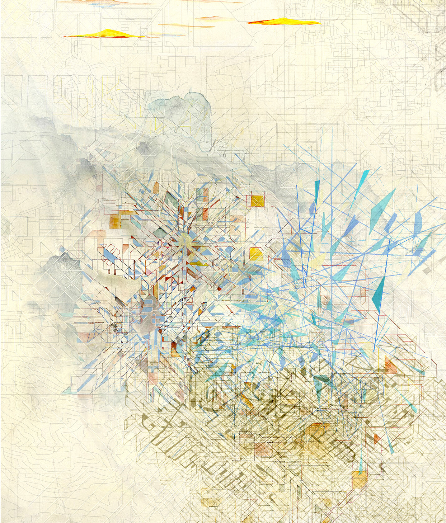
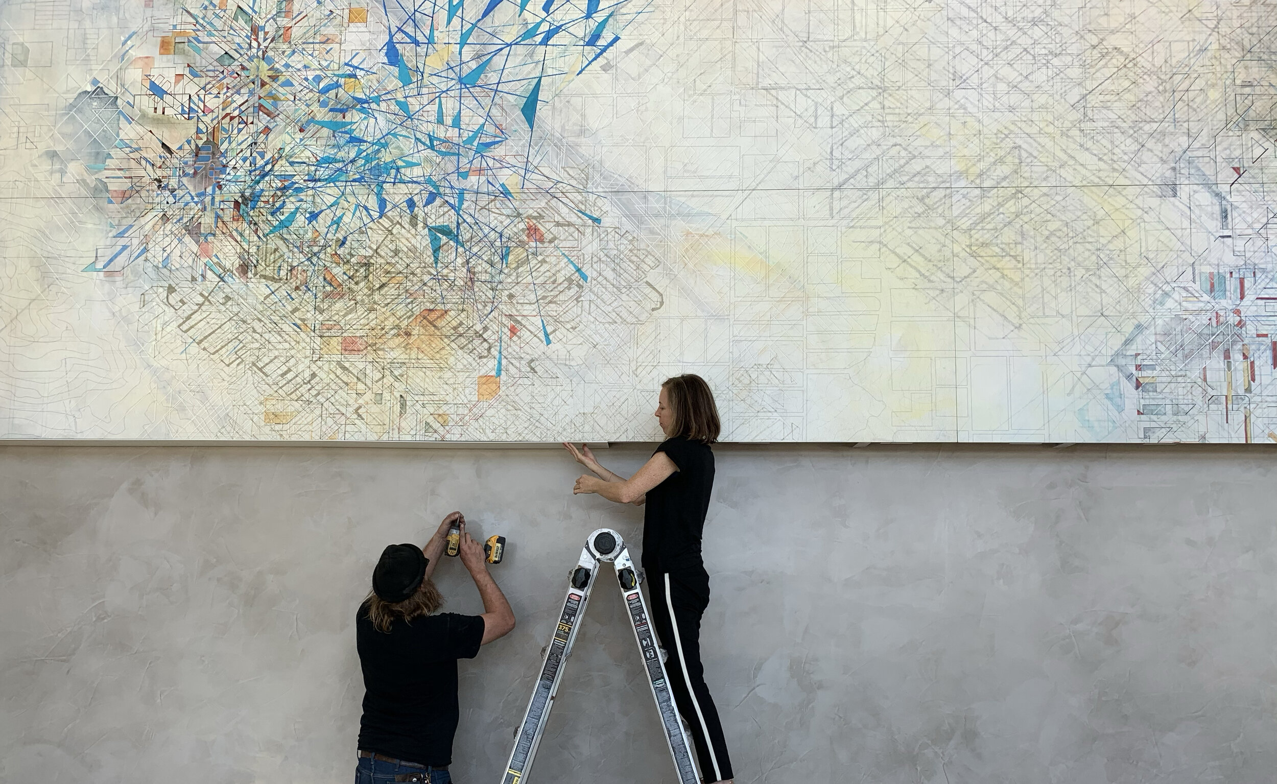
Intersections: Prairie, Ranch, City (DFW/SF)
Ink on wood panel, 28 feet x 18 feet, 2020
Hughen/Starkweather was commissioned to create a large-scale artwork for the main lobby of a new Dallas/Fort Worth corporate headquarters. The abstract artwork is based on a map of the Dallas/Fort Worth area, easily recognizable to those who live and work in the area. But the artwork also references more subtle overlaps, connections, and intersections of the natural and built environments of Dallas/Fort Worth and the San Francisco Bay Area, where the company was founded. Abstracted lines and shapes map centralized urban grids, while outlying shapes reference spacious farmland, open prairies, and rolling hills. Specific colors are based on the quality of light, the big sky, and various bodies of water in and around North Texas and Northern California.
In addition to making visits to the site and referencing maps and photos of these landscapes, the artists invited people living in the Dallas/Fort Worth area to describe the landscape in their own words. Some of those words included: calm, rustic, diverse, sprawling, expansive, growth, vibrant, big, open, dry, barren, flat, smooth, shiny, windswept, rounded, segmented, sunny, grassy, dry, earthtones, ochre, light olive tan, mesquite green, pale orange, and sky blue.
The artwork was fabricated in collaboration with Magnolia Editions in Oakland, CA.
Details of the work